From humble beginnings, ‘social media’ has transformed into a multi-purpose entertainment and informational tool that more than 3.8 billion of us use almost every single day.
In fact, it has overloaded us with information. So much so that we don’t have enough time to take it all in. That’s why, over time, platforms such as Facebook and Twitter have pivoted to favour visually stimulant content. After all, humans by their nature and instinct are visual beings.
Adding to that, platforms such as Instagram, TikTok and Snapchat have all built an incredible network of users by favouring visual content. And that’s where Graphic Design comes in.
Visual Overload
Memes, photos, infographics and interactive videos. Load up your favourite social media app and that’s what you’ll find. Why? Because 90% of the information that our brains process is visual.
Although these platforms were originally purpose-built for the everyday user, businesses too have to compete in that space, which is why sometimes companies and influencers might look to buy real TikTok followers (an option available for most social media platforms). Simply put, if your brand communicates through social media then striking social graphics should play an important role in your strategy, as it has proven posts perform better when paired with visual content.
And while you won’t necessarily need to communicate through memes (it’s not right for all brands), it’s important to remember you’ll be in competition with them. And with that in mind, it’s how you can make your content stand out in a crowded social space.
“Designing for social is much more frequent now than ever before. Companies are realising the importance of this and are putting more and more attention on creating quality content.
Brands are now hiring creatives specifically for the purpose of growing their social presence, increasing their following and by extension expanding the number of people the brand can reach.“
Callum Bedward-Brooks, Creative Designer
Eye Catching Graphics
We’ve established that you need to use graphics within your social content, but what truly matters is creating the right social graphics that strongly appeals to your target audience. So what’s best practice when it comes to designing for social media?
1) Define your end goal
The first and most important step is setting an individual goal for each post – the same applies to all marketing activity. Ask yourself, what is the purpose of your post? Are you aiming to drive sales, increase traffic to your website or increase engagement on your channel?Clearly outlining your goals will help you align your graphics accordingly and drive measurable metrics for your brand. However, avoid having too many goals as it may create a really busy graphic. Keep your goals and the design simple so your audience will understand the message you’re trying to convey right from the get go.
2) Maintain consistency
Create a colour scheme that accurately reflects your branding and values. Academic studies on colours in marketing point out it’s more important for colours to support the personality you want to portray instead of trying to align with typical colour associations. Finding your colour palette is key to your online success. It helps your social media channel look and feel connected – with visual cohesion across both brand and social content. That way, your audience will be able to recognise you and your content instantly. Start off by selecting two to three main colours. When selecting your colours, ensure the ones you choose compliment each other and contrast enough. It will improve your graphic’s readability and visual appeal. This brings us to the next point.
3) High contrast. High impact.
The right balance of contrast can bring a social graphic to life and effectively enhance certain elements. Too little contrast and the graphic will be “flat”, whereas too much contrast will create clutter.This is where your colour scheme comes into play. Colour is the easiest way to implement contrast into graphics, for example pairing light colours against dark colours. Social media graphics are moving away from the minimalist design trend, brands will be opting for brighter and bolder colours to stand out from brands with an outdated minimalist style.If possible, don’t forget to incorporate the brand’s colour scheme for consistency. Lastly, avoid competing with the social platform’s colour if possible e.g. blue for Facebook. After all, you don’t need more competition.Contrasting can also be done by pairing a playful font with a simple font, it’s a great way to add some personality to your design.
4) Emphasise your text.
We know you have a lot to say about how fantastic your brand’s service or products are, but, avoid using too much text. Heavy copy will crowd your graphic and will turn audiences away.Keep information short, concise and visually stimulating. If your audience wants to find out more information, they should be able to find it in the caption of the post – not in the graphic itself.Try to limit yourself to one or two lines, regardless of which platform you’re designing for. We also recommend you to utilise a visual hierarchy to make the headline or key information standout. Similar to punctuation, hierarchy helps the reader to prioritise and order the importance of information – helping the reader digest the information.Social media users skim rapidly, using visual cues such as bold font or vivid strong colours will help capture their attention.
“With social creative, there is always the opportunity to put text content natively in the post to accompany the imagery/video. Too often, we see examples of companies cramming graphics with text and heavy messaging. This gives two main issues. Firstly, the graphics are often inset and small on a mobile device timeline offering poor legibility of smaller text. The other issue is that the post can end up looking like spam/heavy advertising.
So, for social design it’s possible to leave a lot more of the copywork to the actual post text. Whereas, for digital advertising and even print advertising all of the messaging has to occur inside a single piece of content.”
Matt Ansell, Creative Director
5) Be creative
Have fun and be creative with your content – it will help your brand stand out. Many companies are starting to experiment with different types of graphics, from simple infographics to short animated videos. We’ll touch more on animations later in this article. One of our favourite creative content examples is Breakout Clips. The clips features scroll stopping special effects to grab social media user’s attention and drives leads. Take a look for yourself.
The internet has made it ridiculously easy to access free high-quality stock imagery and graphics. While it can be tempting to use them… try to limit using them. You want your content to reflect your genuine brand message and to make your products and employees look good.
“As time goes on, people are becoming more attuned to seeing through bad design and more so clichéd stock photography. Careful selection of stock imagery and effective treatments are more important than ever – so many companies are sourcing their images from the same libraries. Having the ability to mix up first party professional imagery with well selected stock imagery can give companies the individuality and recognisability that is needed.”
Matt Ansell, Creative Director
6) Sizing Matters
Another headache for creative teams is the myriad of sizes that social graphics must adhere to. With new social media platforms and the current platforms offering new types of content, sizes are always changing!Each device and platform has its own unique features and different consumption behaviour that impacts how people process the content. Graphics need to be tailored to the sizes and preferences of the respective social media platform to create the most impact.
To make things easier for you, we thought we’d share our social media graphic size cheat sheet for 2021.
Facebook Image Sizes
Image Post: 1,200 x 630
Share Link Image: 1,200 x 630
Header Image: 820 x 312
Event Image: 1920 x 1080
Twitter Image Sizes
Single Image Tweet: 1,200 x 675
Two Images Tweet: 700 x 800
Three Images Tweet: Left Image 700 x 800 / Right Image 686
|Share Link Image: 1,200 x 628
Header Image: 1,500 x 500
Fleets Image: 1,080 x 1,920
Instagram Image Sizes
Square Photo: 1,080 x 1,080 (1:1)
Portrait Photo: 1,080 x 1350 (4:5)
Landscape Photo: 1,080 x 566 (16:9)
Stories: 1,080 x 1920 (9:16)
IGTV Cover Photo Size: 420 x 654
LinkedIn Image Sizes
Image Post: 1200 x 627
Shared Link Post: 1200 x 627
Personal Image Post: 1200 x 1200 (1:1) 1080 x 1350 (4:5)
Personal Header Image: 1,584 x 396
Company Header Image: 1128 x 191
Stories: 1,080 x 1,920
Using these recommended sizes will ensure your images are optimally displayed, without unwanted cropping issues.
Stills Vs Animations
We’ve all heard it – ‘Video is King’ – but is there still a place for still graphics? Here is what our resident creative experts had to say.
“When creating content for social media, you have a very small window for someone to see your post—let alone interact with it. When the content is static the user will most likely scan the post and move on if it is not engaging or useful.
With video/animated content the user is much more likely to stop scrolling through their feed and pay attention for even an extra second to try and understand what they’re watching. On top of that video content can be leveraged into smaller pieces and be used as micro content within that.”
Callum Bedward-Brooks, Creative Designer
“Movement can be very effective in capturing attention and the combination of typography with full motion video can deliver effective content. It all depends on the message to be told. Sometimes we see examples of motion being used that effectively make the reader have to work harder to see a simple message.
There are bigger divisions to be made from a cost point of view too. A static social graphic resized appropriately for the key social channels, will be much less costly than one animated, full motion social video. The motion content, whilst engaging can take longer in some cases to produce too. Meaning that if the message is very time sensitive, then it’s probably better to get the content out in static form rather than waiting for animations.”
Matt Ansell, Creative Director
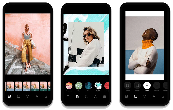
7) The right tools
With the right tools, even non-designers can create stunning social media graphics in minutes. One of our favourite apps to use is InstaSize, a multi-functional photo and video editing platform that’s easy for anyone to use. It allows you to apply filters, create layers, resize images, apply overlays and do much more.
And that’s it for all of our top social graphic tips and tricks you can use to create better, more engaging visual elements for your graphics. Did we miss any of your favourite design tips? Let us know by tweeting us or contacting us directly.