The Challenge
Wise approached us to elevate their brand identity – not just as a refresh, but to create a premium look that would set them apart from competitors and position them to partner with the biggest players in their industry.
Beyond standing out in the market, brand cohesion was key. Wise needed a consistent visual language across everything – from brand applications to internal documentation. Crucially, the new creative had to work seamlessly with both their existing logo and app design, as a full overhaul of the system’s UI wasn’t part of the scope.
The Solution
From our initial discovery sessions, we built an instant connection with the Wise team, gaining a deep understanding of their mission, vision, values and audience. With these insights in hand, we set out to craft a brand identity that reflected their ambition and long-term vision while providing the credibility and flexibility to grow.
Wise needed a brand that felt premium and credible, while also remaining modern, efficient, and seamlessly integrated into their digital landscape. It had to be bold enough to stand out, yet structured enough to instil trust and clarity.
With these goals in mind, we designed a visual identity that strikes the perfect balance between refinement and impact.
Company Overview
Wise is a market leader in driver onboarding, compliance and payment automation software.
What we provided

The Results
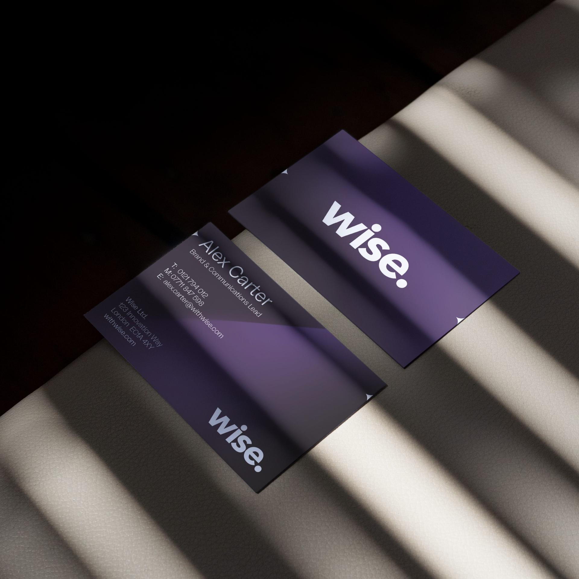
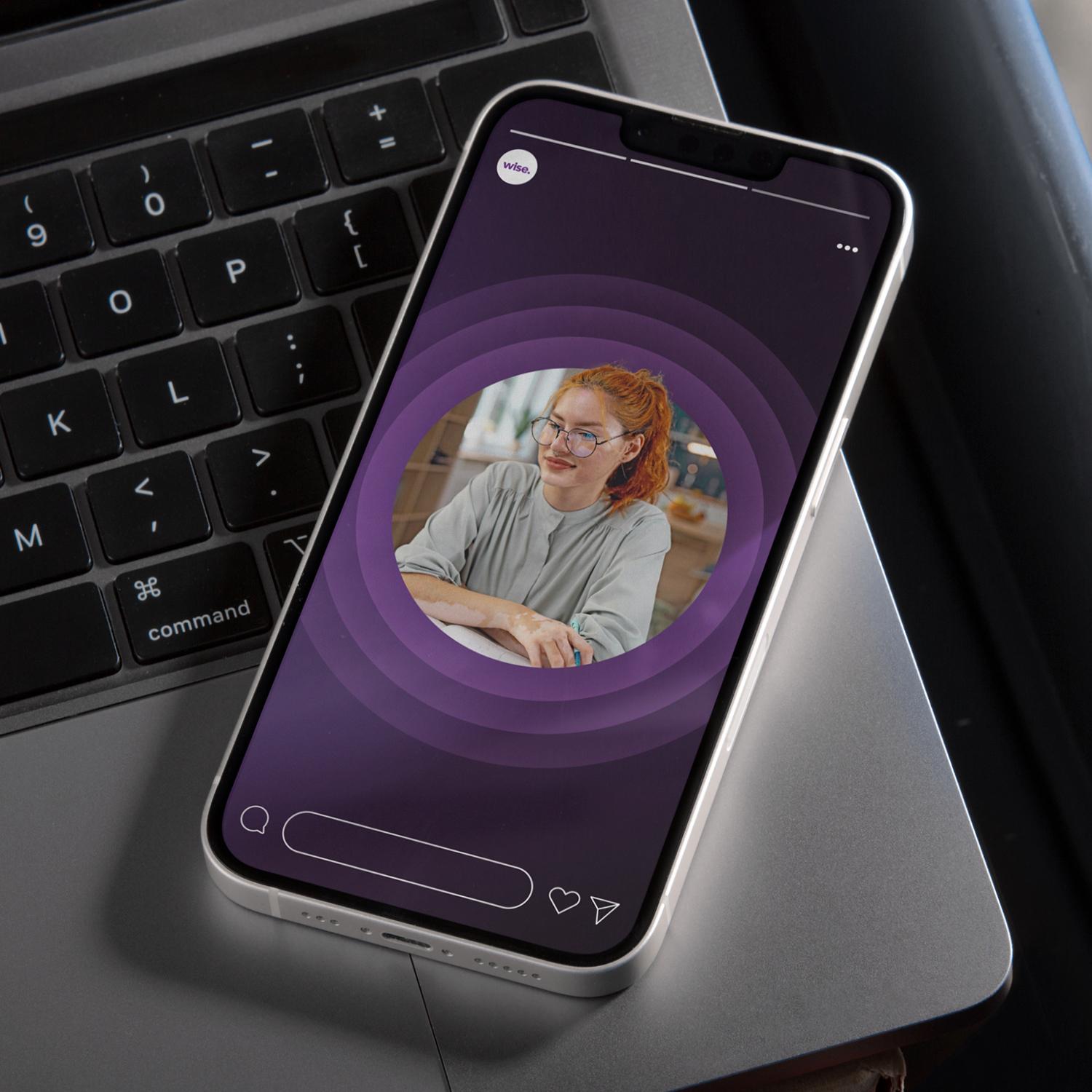
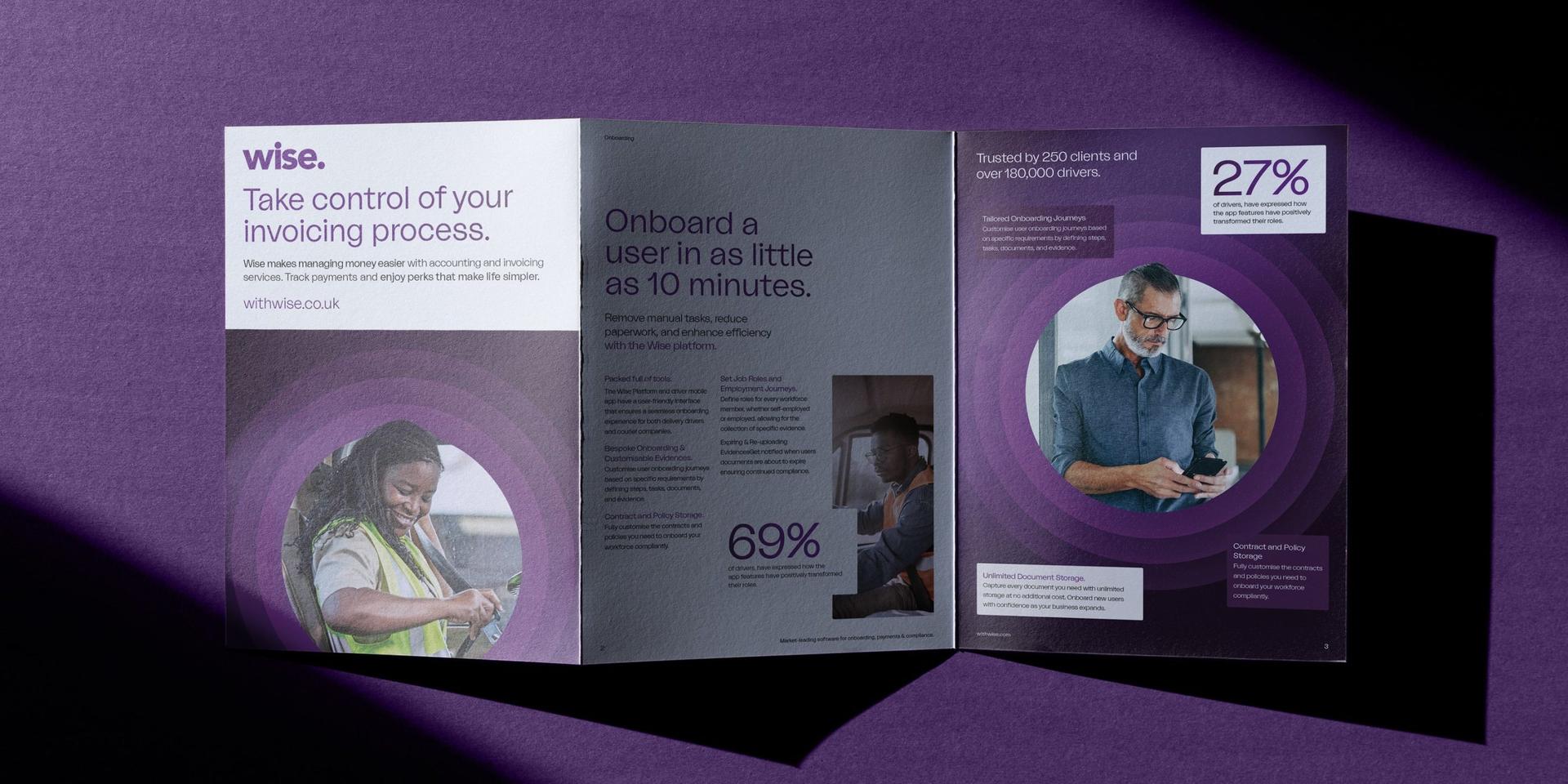
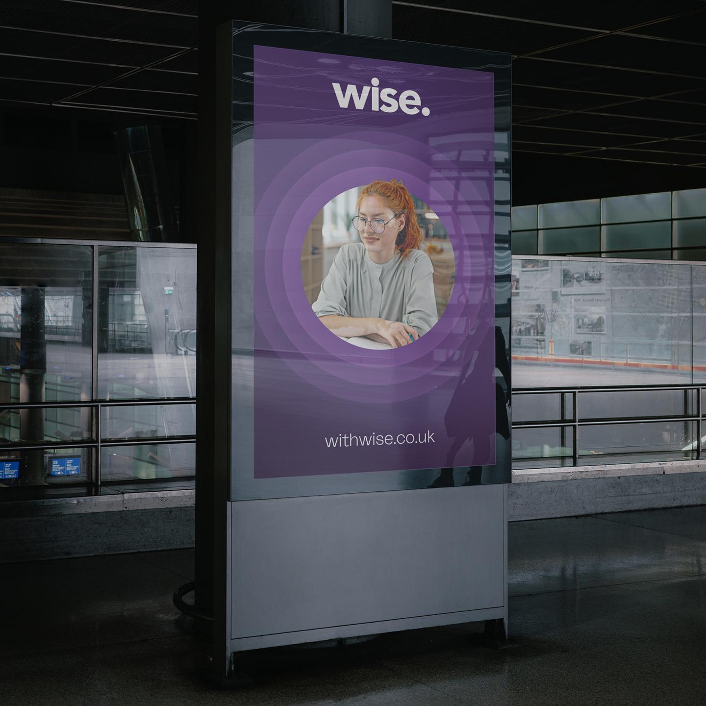
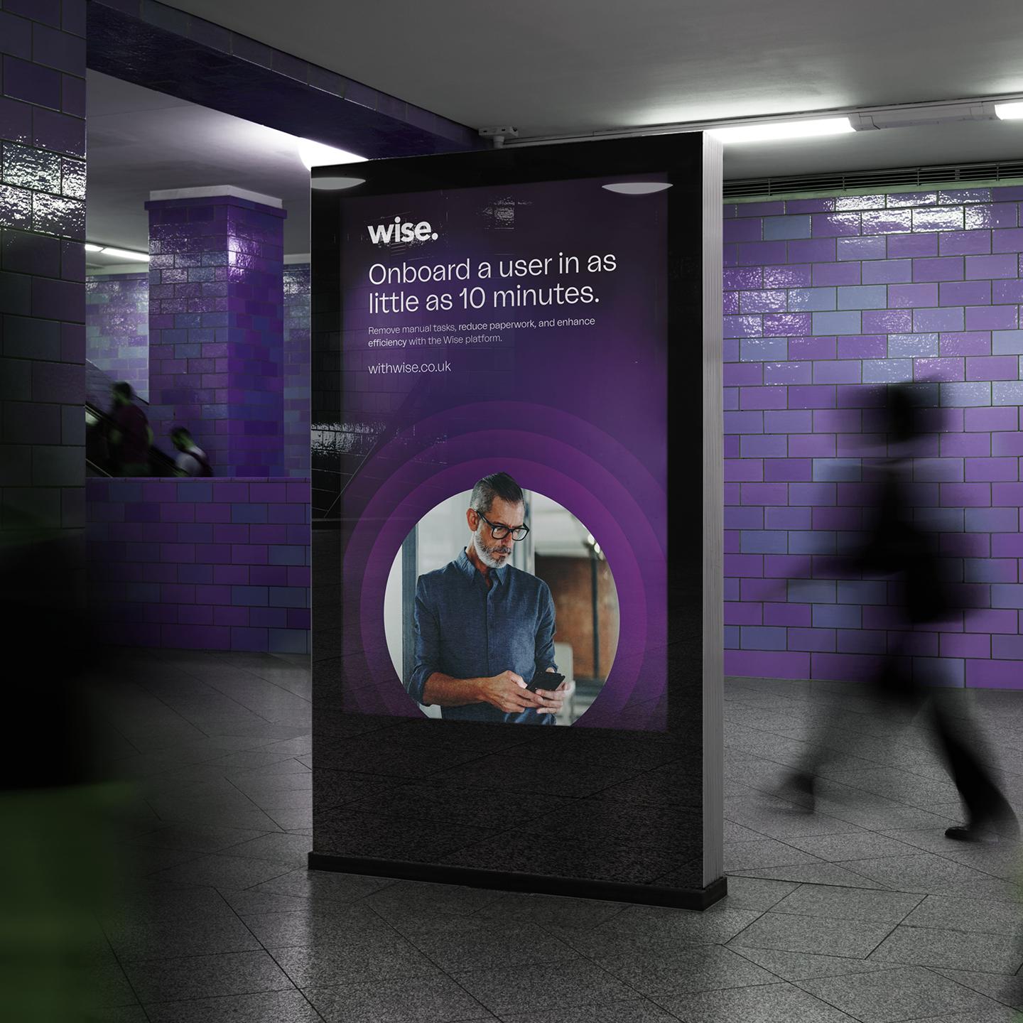
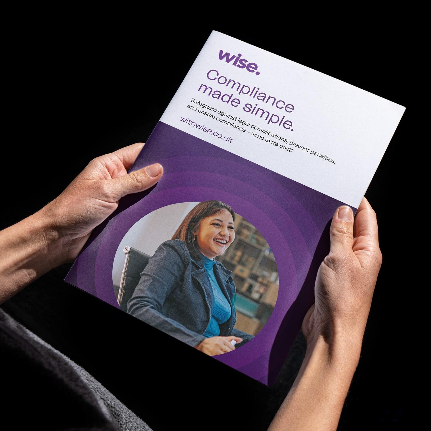
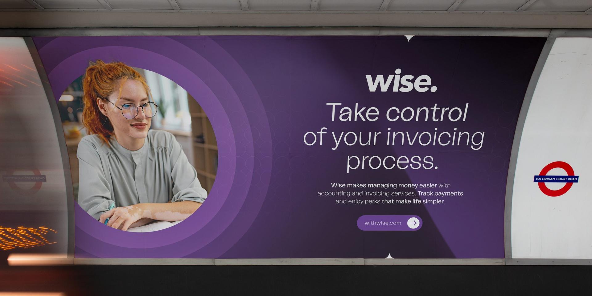
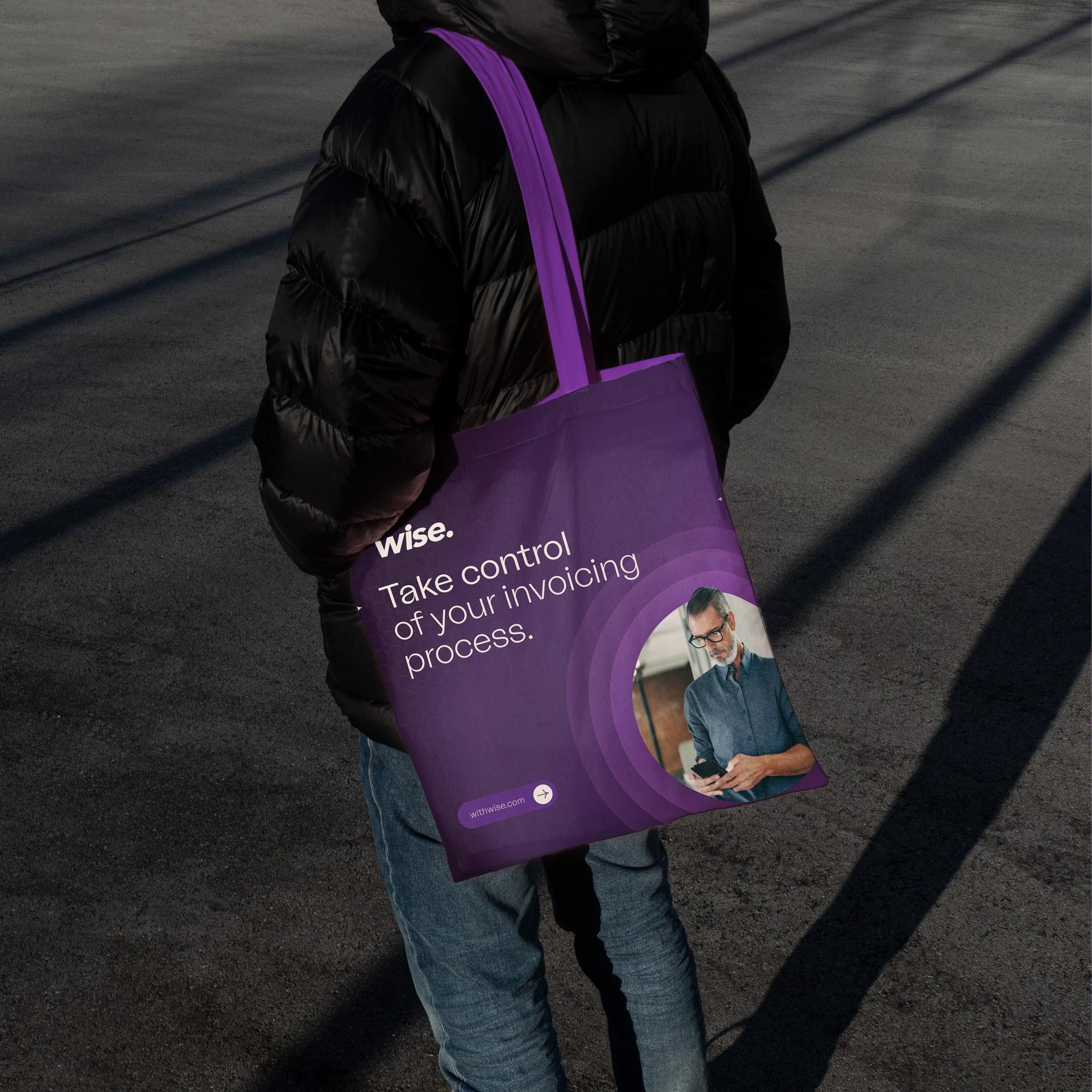
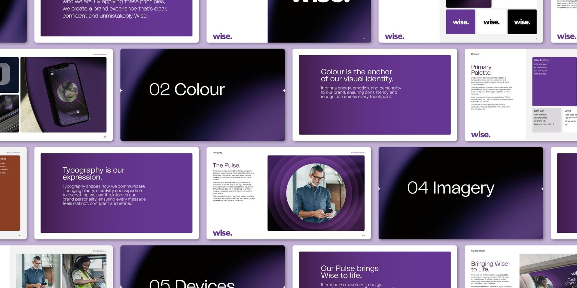
At the heart of the new Wise brand is The Pulse – a dynamic design element inspired by the dot in their logo. This circular device acts as a core visual anchor, reinforcing brand cohesion, framing imagery and adding depth. The layered structure mirrors the movement and order that Wise brings to complex processes, further tying the creative to their offering.
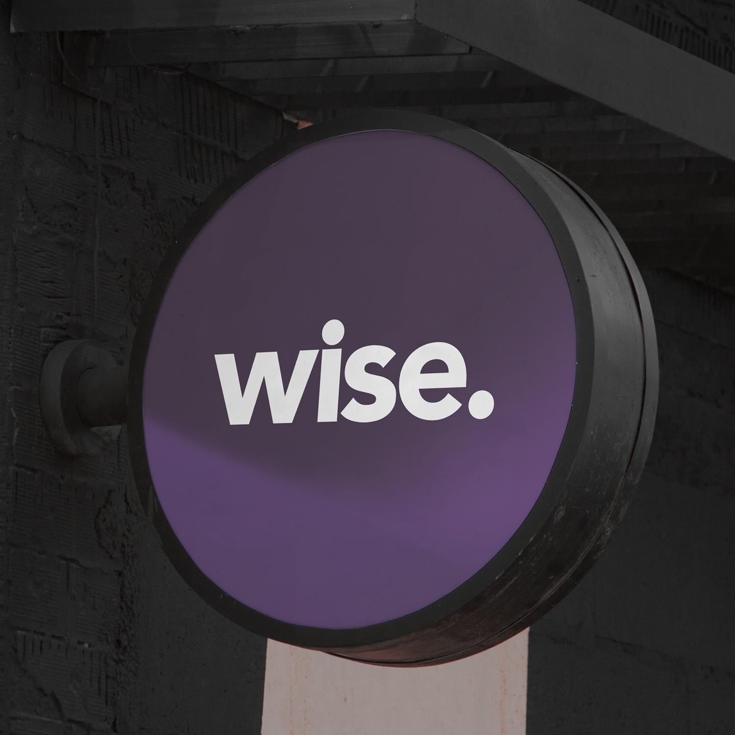
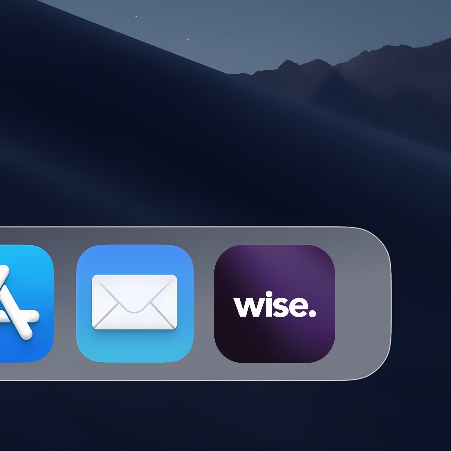
We refined their signature purple, introducing richer, more premium tones that elevate the brand’s presence. These were paired with deep, bold accent colours, adding contrast and sophistication. Bespoke shift gradients and textural elements enhance the overall aesthetic, creating a high-end, tech-driven edge.
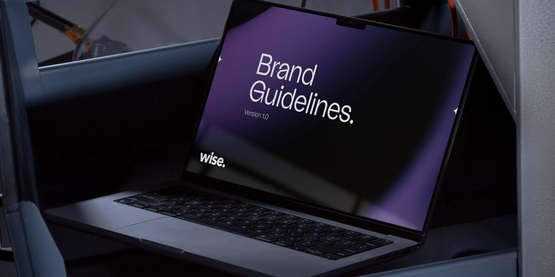
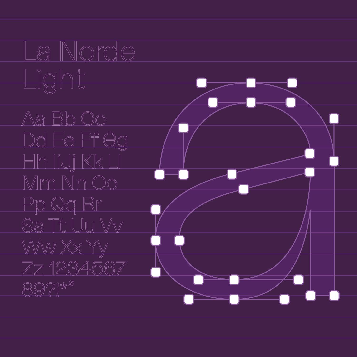
Typography plays a key role, balancing modern, structured layouts with a clean and approachable tone. We selected La Norde Light, which offers a refined yet accessible feel, striking the perfect blend of premium quality and usability.
By approaching the rebrand with insight-driven creative thinking, we’ve given Wise a new visual identity that not only aligns with their current offering but also lays the groundwork for long-term growth in their evolving industry.


Our clients love what we do!
We worked with Jask and, through multiple workshop sessions, they were able to fully understand our vision, helping us create a premium identity that still feels authentically Wise. The refined typography, Pulse device and elevated colour palette have given us a distinct edge in the market. The whole process was collaborative and Jask has been more than happy to make tweaks and adjustments along the way to ensure everything feels just right.