Responsive web designs have gained an astronomical amount of momentum over the last decade thanks to the rise of mobile usage. Do you remember the times when you had to zoom in to a shrunken version of a desktop site on your phone? Certainly not ideal. And certainly not a user friendly experience, as you were most likely viewing a static website.
Thankfully, those desktop-only days are gone.
But, what exactly is responsive web design?
The term ‘responsive web design’ was coined and largely developed by Ethan Marcotte. His article ‘Responsive Web Design in A List Apart’ covers the concept of building a website that responds to the surroundings of its media type and size.
Our screen sizes are forever changing. Think phones, “phablets”, tablets, desktops, game consoles, TVs and even wearable devices such as smart watches. Smaller devices are often constrained by their display size and require a different approach. It’s more important than ever before to design and build a website that can adapt to every device and screen size – today or in the future – to provide an intuitive and gratifying user experience for everyone.
Responsive web design is dependent upon three things:
- Media Queries
A popular technique used to modify the site depending on the device’s characteristics or parameters (such as the browser viewport or screen resolution). Media queries are logical expressions that test for the device’s value which can then be resolved to either true or false. This enables web designers and developers to add conditions to their styling and customise the presentation of the website to specific devices and screen sizes. - Fluid Grids
A web grid utilises a column design to manage the space and layout of a website. It can be either fixed or fluid. A site built with a fluid, flexible grid adapts the content, so after the media query, the site will restructure itself and cascade the information accordingly to the screen size it’s being viewed on. - Flexible Images
Also known as adaptive images. Typically, when you upload an image to a website it has an absolute set width and height. A fluid and flexible website isn’t all that flexible if the content elements are fixed, which would completely defeat the purpose of having a brilliantly set out page. The media queries detect the screen size and then it automatically scales and resizes all the images.
Inevitably, the revolution of responsive web design has meant that web developers have had to adapt responsive design and functionality into their bespoke website designs. Today, the majority of people are familiar with the capabilities of responsive design.
However, if you’re still a bit unsure, simply shrink your browser down and watch the magic happen. Great responsive websites should automatically rescale themselves as you change the browser window size.
Great responsive websites examples:
To show you some remarkable examples that implement responsiveness in all its glory, we’ve tasked our resident web developers and user experience experts to pick out their favourite websites.
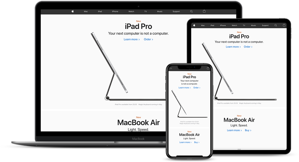
Apple

It’s no surprise that we’re all massive fans of the tech giant here, don’t trust a creative that doesn’t utterly adore their Apple devices. Our web developers comment on their enthusiasm for Apple’s streamlined approach to scaling and flexible images:
“Apple changes certain images for different screen sizes, for example the MacBook Air changes from horizontal image to a more vertical image. It’s pretty cool as it makes more use of the vertical space available on mobile devices”
Kyle Russell
Web Developer
“The website scales their animations and interactions down really well on smaller screens. A lot of sites just remove them completely and scale things right back and cause the mobile experience to be much more compromised when compared to the desktop experience.”
Luke Turner
Technical Director
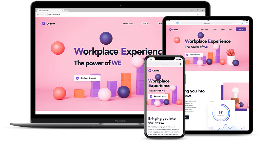
Olumo

Innovative work experience and solution company, Olumo, takes responsive websites to another meaning. They utilise a clean cut design with high contrast complimented with responsive animations. Our user experience and graphic designer comments:
“The floating elements of the website smartly pan as you scroll further down. Changing to mobile shows how cleverly each asset has been designed as all information stacks neatly above each other for a smooth user experience.”
Callum Bedward-Brooks
Creative Designer
Hines

Intelligent real estate investment company Hines, caught the attention of our Digital Project Manager. She comments:
“B2B websites tend to focus on desktop experience purely because it’s usually browsed during office hours and most likely on a stationary or laptop device. It’s always interesting to see the different approaches companies take when making their sites suitable for people on the move; what I love about Hines approach is the attention to detail. On desktop, the larger menu is clearly divided in primary and secondary, with the primary menu having further support information so people know what to expect from the page. On mobile, the menus are hidden behind a burger menu that cleverly has a word “menu” as the middle stripe. The pages are very engaging and attention capturing and this mixture of media and text does not get lost on a smaller device version of the site.”
Kristiana Briede
Digital Project Manager
Things to consider when designing a responsive website
After seeing some good examples of responsive websites, you’re probably itching to dive into a new web project or tempted to pick up that phone and start calling our brilliant web developers here in Birmingham. But, before you do, there are a few considerations you should bear in mind.
- Functionality
Many web designs come with wonderful graphics and are a representation of true art. However, we shouldn’t forget that a website is an online marketing tool, first and foremost, and no matter how pretty your site is, if it fails on being practical to the end user, then it fails altogether. Your site must now account for mobile functionality and how it interacts with users on touch screens. Take into consideration the differences between using a mouse and finger for touch screens. Fingers allow for bespoke functions such as pinch zoom. - Screen Real Estate
Screen sizes vary massively, from desktops to tablets and smartphones. The space your website has to work with, has to adapt accordingly to the device. Condensing your site into spaces that can be no larger than five inches is a difficult task, you should strategically place the content that’s best for the end user. It’s best to reduce the content and focus on the key information rather than overloading your site with large amounts of text. Often you’ll find the simpler it is, the better. Cliché but true. - Your Audience
A lot of these considerations boil down to who the target audience of your website is. Put yourself in their shoes and envision what they would want when they are viewing your site from tablet or smartphone. Their user journey and experience is what matters the most. If your website isn’t intuitive and has complex navigations, this creates a difficult time for your end user and your conversion rate ultimately suffers.
Go Mobile or Go Home
Since the introduction of Apple’s first iPhone, smartphones have grown year on year to become the basic standard and the norm for people to have in their pockets. Access to the internet is no longer for the tech savvy but for anybody and everybody at the tap of their fingertips.
Back in 2015, Google rolled out a change in their algorithm to factor in a website’s mobile presence and usability as a significant factor in Google’s search ranking. Neglecting to accommodate a mobile friendly website will not only negatively impact your overall success in search engines but it also drives potential leads away. 40% of users have gone to a competitor’s website after a poor mobile experience, not to mention there are now more searches on mobile than desktops, with mobile devices now accounting for 52.6% of global web traffic.
Think about it, how often have you been sat with a smartphone in your hand, wanting to make a purchase or access some further information, only to find your would-be seller has a poor mobile website that doesn’t work or you can’t find what you’re looking for? It frustrates us beyond belief. That’s why most smartphone users won’t put in the effort to browse a website that isn’t mobile friendly, especially when they can easily hop right back to the search results and go to another site that’s easy to navigate.
Put simply, your mobile site speaks volumes. It needs to be dedicated with all your essential information, products, services and contact details squeezed into one easy to use and beautifully presented bite sized portion. Increasing your digital presence, improved customer journey and maximising mobile conversation rates are some of the few benefits of a mobile responsive website. We’ll have another blog coming out soon that covers mobile friendly websites in depth, so be sure to come back and check it out.
So there you have it, everything you need to know about responsive websites and why mobile friendly sites are imperative to a business’ success. Above all else, long hard planning and research needs to go into a responsive website, and giving due care to improved user experience is what we believe is the ultimate goal to a sustainable website.
Even though we’re clearly web fanatics, we’re more than a responsive web design agency in the West Midlands – we also have spectacular graphic designers to boot too. From web designs, web hosting and bespoke content management systems to creative design services, we’ve got you covered for your all marketing needs.
