BFS launches new campaign to highlight benefits of invoice finance
Independent SME funder, Bibby Financial Services (BFS), has launched its latest marketing campaign alongside Solihull-based marketing agency, Jask Creative, to highlight the benefits of Invoice Finance for larger businesses.
‘Funding UK Business Success Stories’ is a multichannel B2B marketing campaign designed to demonstrate BFS’s funding capability for Corporate businesses – those with turnover greater than 5m. Since March, the funder has helped SMEs to unlock more than 2.5bn via its invoice finance solutions.
“Our Corporate team recently celebrated a record month, providing more than 40m in new funding so we wanted to do something to celebrate the success stories behind the clients we support.More than ever, at this critical time for UK PLC, it’s important for businesses to understand how invoice finance can unlock cashflow and working capital, without them having to take on additional term debt. Our work with Jask Creative is designed to demonstrate the benefits of Invoice Finance and Asset Based Lending to a wider audience.“
Adam Park, UK Marketing Director at BFS
“With BFS, it’s immediately evident that client relationships are the cornerstone to their success as a funder. It was important to uncover the perspective of BFS’s clients first-hand, drawing out the emotion behind their stories – resulting in a powerful and uplifting campaign.”
Phil Kean, Client Services Director at Jask Creative
According to BFS’ latest Covid-19 Impact Study, more than two-fifths of businesses have been forced to take furlough leave, with half being paid later by customers. More than a quarter (28%) have suffered from bad debt. The same can be said for across the pond in America, they are in need too, and will look towards businesses such as L3 Funding to help business financial needs during this time. It is a critical and unpredictable time for businesses all across the world, with the pandemic having a major impact on most businesses, small and large. Now more than ever, businesses need that financial boost from investors, financial institutions, and the like, so that they are able to recover their losses and get back up on their feet. So, it comes as an advantage when business owners find that they are able to open accounts with merchant providers like Payment Savvy that offer high risk credit card processing so that even at a time when they are unsure of their place on the success ladder, they are still able to sustain themselves. Along with this, leveraging invoice financing options could let businesspeople everywhere breathe a sigh of relief.
Adam added:
“Despite the significant challenges posed to UK SMEs in 2020, the Invoice Finance sector remains open for business with capacity to support more businesses. Jask Creative have developed a high-impact campaign that gets this message to a wider audience, across a variety of channels, and we’re looking forward to sharing these success stories over the coming weeks.”
We all know how powerful a tool email marketing can be to reengage with existing customers. Whether it’s letting them know about new products or services or alerting them to upcoming news and updates via a newsletter, it’s important to plan these emails properly so that they go to the right people at the right time. To do this effectively, you should implement an automated email strategy. In this article, we are going to highlight the importance of different types of automated emails you should be running, how to best implement them within your store and what value they can have for your business.
Abandon Cart & Abandon Browse Emails
Cart and browse abandonment is a common thing for eCommerce. We’ve all done it; we add an item to the cart with the intention of buying it and then, for whatever reason – maybe we lose interest or decide to look at another store first, regardless of the reason – we leave.
And this is the case for a substantial percentage of online customers too. Does that mean that that customer, that potential revenue is lost forever? No, it doesn’t have to mean that.
The reason this is so important for your site and the reason it’s so beneficial also is that; new client acquisition is the most expensive thing for E-commerce sites. If your site conversion is 4% that means that 96% of potential customers never buy from your site and leave. With an abandon cart function, you have the ability to retarget those people that got so far along the buying journey and increase your conversion rate from 4% to upwards of 7% if you have a dynamic retargeting strategy.
How can you make your Abandon Cart and Abandon Browse emails convert more customers? You could offer that customer an incentive that would entice them to complete their purchase, something like a code for 10% off or £5 off of their order. You could highlight your USPs, such as Free Delivery. Or, you could look to make their experience easier, by offering them recommended products that they are more likely to buy.
Post Purchase Emails
Another automated email strategy you should be running is follow-up purchase emails, or ‘Post Purchase Emails’. Now the most basic option; that you are likely already running is the thank you for your purchase email – which is great to have up and running, however, there is much more you can add to this strategy to allow for customer loyalty and more repeat customers.
Here are some options for post-purchase emails:
‘Leave us a Review’
Review emails are very self-explanatory. You send a customer an email after their purchase arrives and ask what they think of it. We all know the power of reviews for increasing usability and the conversion rates of your site. This is great – you get a streamlined review, the customer understands what the email is for; and if they enjoyed the product it works as a potential indirect upsell.
Another way you can implement review Emails is directly after purchase. You may be thinking ‘but how are they going to review the product if they haven’t received it yet?’. They’re not. They’re not reviewing their purchase. In this email you should instead be asking for feedback about your site, your services offered or your product range. While these reviews can’t bolster the marketing capabilities that product reviews can, they allow you to instead get direct feedback and know what is and isn’t working in the customer buying experience.
‘Products recommended for you‘
Recommendations are something you want to be giving to your customers – You want to make a customer’s journey feel specific and more personalised. By sending recommended products to a customer after their first initial purchase, they will be more likely to shop with you again. You’ve not only made their next purchase simple and easy by giving them more inspiration and directing them straight to something they may want. You’ve also made their experience more personal and more specific to them. For instance, if your store sells skincare products, and a customer has bought some basic essentials, like moisturiser and face wash. To encourage them to purchase again, you could send them an email recommending more products within that range, or even application tools.
Newsletters / Informative Emails
Newsletters are a great way of strengthening your relationship with your customers and building up rapport, as well as informing current or prospective customers about your brand/business. There are many different angles and strategies around this type of email, from offering up educational content on how to best use your products, to announcements within your brand that might be of interest to your customers.
They are also a good way to keep your subscribers engaged without overloading them with purely sales-based emails. Offering them different content and something useful will keep them interested, and might also encourage them to share this information with others.
Now, this may initially seem like a waste of time. Why would you want to not sell your products? Well, whilst you aren’t pitching for a sale in these emails you are priming your readers for their next purchase. If they trust you as a business they are far more likely to come back for repeat purchases. We hope that this article has given you some insight into the importance of automated email campaigns, how to implement them in eCommerce and how they can aid your marketing strategy.
Construal level theory is a multi-faceted term. In short it describes how the distance between ourselves and an object dictates our relationship to that object. For example the closer we get to a sign in the distance the easier we can read and understand what that sign says.
Construal level theory is mostly used in reference to social or psychological distance. For example, we put celebrities on a high horse because we have never met them before. But if we were to meet them, we may realise that they are not as different to you and I as we initially think.
How do you use it?
In marketing, construal level theory (CLT) has long been used to dictate how often a brand should and shouldn’t reveal the inner workings of their brand. Whether or not they engage with their audience and what platforms they choose to be present on at all.
This is so the perception we have of them is maintained. We have such a high perception of brands such as Moschino and Chanel because we know little about the day to day of what they do.
Should you use it?
However, with the rise of platforms such as TikTok, this concept is fading away. With influencers and TikTok creators being those who dictate culture – especially for younger audiences, higher value brands are starting to drop the barrier between them and us. Why? Don’t believe us – Here are a few examples of TikTok stars being invited to shows during various fashion weeks around the world. There are endless examples. Prada invited Charlie D’Amelio, Emma Chamberlain’s long time ambassadorship landed her on the front row at Louis Vuitton, Noah Beck saw Moschino and Thom Browne, alongside Lil Huddy… the list goes on. Other brands that invited TikTok stars were Coach, Peter Do, Proenza Schouler, and Staud.
Brands that make the biggest impact on TikTok are those who choose to engage with the platform and embrace its trends. Some may even go to somewhere like Enforce Social to get a little extra help when it comes to getting followers who, hopefully, with engage with their content and share it around so that it reaches as many people as possible. Some brands, of course, are already global giants in their industries, so won’t need to do this. For example, Gucci paved the way when it comes to engagement with its response and reposting of content from the #GucciModelChallenge. This contest has racked up more than 269 million views. Through interesting and quirky videos, they are also interacting with their fans in two-way conversation.
Another great example of this is Elon Musk. With the way Musk frequently interacts with audiences on Twitter and his clear knowledge of meme culture, you wouldn’t peg him to be the most valuable man on the planet but, here we are and there he is – Some would even argue that it is partially because of this that Musk has become as valuable as he has.
But why bother?
Why Should brands actively engage with their audience if their brand image is established already? Surely they don’t have a myriad of avid Gen-Z TikTok users as their buyer base. Well, the answer is likely twofold. Platforms like Snapchat and TikTok offer brands platforms to operate creatively, while staying authentic and true to their established brand image. Also the new generation of buyers value authenticity over anything else. Gen-Z buyers have grown up with most things in their lives being very overproduced and so they favour things being more authentic.
Should you drop the idea of Construal Level Theory for your brand?
To some extent – yes! Obviously you aren’t about to share important legal documents with your following but, as a marketing tool, engaging with your audience more isn’t likely to destroy their perception of your brand’s value.
Here are a few ideas how you can engage on a more personal level with your audience.
Behind the scenes – Giving your audience a peak behind the inner workings of your brand is entertaining if nothing else. It also allows the audience to relate to the employees a bit more as that is much easier than relating to a faceless logo or name.
Share user content – show that you actually care about your consumers by showcasing content they have made that features your service or product.
Engage in trends – Maybe a particular TikTok trend has popped up or something in the larger pop culture world is happening that you find entertaining yourself. Offer your own spin on it and allow others to engage (it also lets you latch on to larger trends and bring more exposure to your brand as a bonus.)
Last week the annual John Lewis Christmas advert was released. Every year it is interesting to see how different brands react online. This got us thinking about reactive marketing.
What is Reactive Marketing?
Reactive marketing refers to campaigns, adverts or social media marketing posts that are responsive, unexpected and sudden. It is the opposite of proactive marketing, where relevant posts are planned in advance to go out in correspondence with individual dates and events.
Why is Reactive Marketing so effective?
Reactive marketing is effective because it is timely, relevant and has the potential to go viral. By getting on a trend or reacting to something that has happened in real time with an on brand post or campaign. It also makes your brand seem more relatable and in tune with current events,
Does Reactive Marketing have any drawbacks?
As with any marketing campaign there is always a chance it may not be interpreted as originally thought. With reactive marketing, brands typically want to jump on trends as quickly as possible and therefore it has less planning and creates more room for mistakes.
Reactive marketing should remain on brand and relevant. And care should be taken so that it doesn’t offend or single anyone out.
Here are some other great examples of Reactive Marketing
Certified Lover Boy
Drake’s album cover art for his sixth album Certified Lover Boy, was quite ridiculous but also very adaptable, and so we saw loads of brands offer their own take on the artwork.
Free Cuthbert
British supermarket Marks and Spencers decided to take legal action against competitor Aldi over the similarity of Aldi’s “Cuthbert the Caterpillar cake” to Marks and Spencers’ “Colin The Caterpillar cake”. Due to the relatively comical nature of the dispute many brands decided to jump in and give their own take on it.
From humble beginnings, ‘social media’ has transformed into a multi-purpose entertainment and informational tool that more than 3.8 billion of us use almost every single day.
In fact, it has overloaded us with information. So much so that we don’t have enough time to take it all in. That’s why, over time, platforms such as Facebook and Twitter have pivoted to favour visually stimulant content. After all, humans by their nature and instinct are visual beings.
Adding to that, platforms such as Instagram, TikTok and Snapchat have all built an incredible network of users by favouring visual content. And that’s where Graphic Design comes in.
Visual Overload
Memes, photos, infographics and interactive videos. Load up your favourite social media app and that’s what you’ll find. Why? Because 90% of the information that our brains process is visual.
Although these platforms were originally purpose-built for the everyday user, businesses too have to compete in that space, which is why sometimes companies and influencers might look to buy real TikTok followers (an option available for most social media platforms). Simply put, if your brand communicates through social media then striking social graphics should play an important role in your strategy, as it has proven posts perform better when paired with visual content.
And while you won’t necessarily need to communicate through memes (it’s not right for all brands), it’s important to remember you’ll be in competition with them. And with that in mind, it’s how you can make your content stand out in a crowded social space.
“Designing for social is much more frequent now than ever before. Companies are realising the importance of this and are putting more and more attention on creating quality content.
Brands are now hiring creatives specifically for the purpose of growing their social presence, increasing their following and by extension expanding the number of people the brand can reach.“
Callum Bedward-Brooks, Creative Designer
Eye Catching Graphics
We’ve established that you need to use graphics within your social content, but what truly matters is creating the right social graphics that strongly appeals to your target audience. So what’s best practice when it comes to designing for social media?
1) Define your end goal
The first and most important step is setting an individual goal for each post – the same applies to all marketing activity. Ask yourself, what is the purpose of your post? Are you aiming to drive sales, increase traffic to your website or increase engagement on your channel?Clearly outlining your goals will help you align your graphics accordingly and drive measurable metrics for your brand. However, avoid having too many goals as it may create a really busy graphic. Keep your goals and the design simple so your audience will understand the message you’re trying to convey right from the get go.
2) Maintain consistency
Create a colour scheme that accurately reflects your branding and values. Academic studies on colours in marketing point out it’s more important for colours to support the personality you want to portray instead of trying to align with typical colour associations. Finding your colour palette is key to your online success. It helps your social media channel look and feel connected – with visual cohesion across both brand and social content. That way, your audience will be able to recognise you and your content instantly. Start off by selecting two to three main colours. When selecting your colours, ensure the ones you choose compliment each other and contrast enough. It will improve your graphic’s readability and visual appeal. This brings us to the next point.
3) High contrast. High impact.
The right balance of contrast can bring a social graphic to life and effectively enhance certain elements. Too little contrast and the graphic will be “flat”, whereas too much contrast will create clutter.This is where your colour scheme comes into play. Colour is the easiest way to implement contrast into graphics, for example pairing light colours against dark colours. Social media graphics are moving away from the minimalist design trend, brands will be opting for brighter and bolder colours to stand out from brands with an outdated minimalist style.If possible, don’t forget to incorporate the brand’s colour scheme for consistency. Lastly, avoid competing with the social platform’s colour if possible e.g. blue for Facebook. After all, you don’t need more competition.Contrasting can also be done by pairing a playful font with a simple font, it’s a great way to add some personality to your design.
4) Emphasise your text.
We know you have a lot to say about how fantastic your brand’s service or products are, but, avoid using too much text. Heavy copy will crowd your graphic and will turn audiences away.Keep information short, concise and visually stimulating. If your audience wants to find out more information, they should be able to find it in the caption of the post – not in the graphic itself.Try to limit yourself to one or two lines, regardless of which platform you’re designing for. We also recommend you to utilise a visual hierarchy to make the headline or key information standout. Similar to punctuation, hierarchy helps the reader to prioritise and order the importance of information – helping the reader digest the information.Social media users skim rapidly, using visual cues such as bold font or vivid strong colours will help capture their attention.
“With social creative, there is always the opportunity to put text content natively in the post to accompany the imagery/video. Too often, we see examples of companies cramming graphics with text and heavy messaging. This gives two main issues. Firstly, the graphics are often inset and small on a mobile device timeline offering poor legibility of smaller text. The other issue is that the post can end up looking like spam/heavy advertising.
So, for social design it’s possible to leave a lot more of the copywork to the actual post text. Whereas, for digital advertising and even print advertising all of the messaging has to occur inside a single piece of content.”
Matt Ansell, Creative Director
5) Be creative
Have fun and be creative with your content – it will help your brand stand out. Many companies are starting to experiment with different types of graphics, from simple infographics to short animated videos. We’ll touch more on animations later in this article. One of our favourite creative content examples is Breakout Clips. The clips features scroll stopping special effects to grab social media user’s attention and drives leads. Take a look for yourself.
The internet has made it ridiculously easy to access free high-quality stock imagery and graphics. While it can be tempting to use them… try to limit using them. You want your content to reflect your genuine brand message and to make your products and employees look good.
“As time goes on, people are becoming more attuned to seeing through bad design and more so clichéd stock photography. Careful selection of stock imagery and effective treatments are more important than ever – so many companies are sourcing their images from the same libraries. Having the ability to mix up first party professional imagery with well selected stock imagery can give companies the individuality and recognisability that is needed.”
Matt Ansell, Creative Director
6) Sizing Matters
Another headache for creative teams is the myriad of sizes that social graphics must adhere to. With new social media platforms and the current platforms offering new types of content, sizes are always changing!Each device and platform has its own unique features and different consumption behaviour that impacts how people process the content. Graphics need to be tailored to the sizes and preferences of the respective social media platform to create the most impact.
To make things easier for you, we thought we’d share our social media graphic size cheat sheet for 2021.
Facebook Image Sizes Image Post: 1,200 x 630 Share Link Image: 1,200 x 630 Header Image: 820 x 312 Event Image: 1920 x 1080
Twitter Image Sizes Single Image Tweet: 1,200 x 675 Two Images Tweet: 700 x 800 Three Images Tweet: Left Image 700 x 800 / Right Image 686 |Share Link Image: 1,200 x 628 Header Image: 1,500 x 500 Fleets Image: 1,080 x 1,920
Instagram Image Sizes Square Photo: 1,080 x 1,080 (1:1) Portrait Photo: 1,080 x 1350 (4:5) Landscape Photo: 1,080 x 566 (16:9) Stories: 1,080 x 1920 (9:16) IGTV Cover Photo Size: 420 x 654
LinkedIn Image Sizes Image Post: 1200 x 627 Shared Link Post: 1200 x 627 Personal Image Post: 1200 x 1200 (1:1) 1080 x 1350 (4:5) Personal Header Image: 1,584 x 396 Company Header Image: 1128 x 191 Stories: 1,080 x 1,920
Using these recommended sizes will ensure your images are optimally displayed, without unwanted cropping issues.
Stills Vs Animations
We’ve all heard it – ‘Video is King’ – but is there still a place for still graphics? Here is what our resident creative experts had to say.
“When creating content for social media, you have a very small window for someone to see your post—let alone interact with it. When the content is static the user will most likely scan the post and move on if it is not engaging or useful.
With video/animated content the user is much more likely to stop scrolling through their feed and pay attention for even an extra second to try and understand what they’re watching. On top of that video content can be leveraged into smaller pieces and be used as micro content within that.”
Callum Bedward-Brooks, Creative Designer
“Movement can be very effective in capturing attention and the combination of typography with full motion video can deliver effective content. It all depends on the message to be told. Sometimes we see examples of motion being used that effectively make the reader have to work harder to see a simple message.
There are bigger divisions to be made from a cost point of view too. A static social graphic resized appropriately for the key social channels, will be much less costly than one animated, full motion social video. The motion content, whilst engaging can take longer in some cases to produce too. Meaning that if the message is very time sensitive, then it’s probably better to get the content out in static form rather than waiting for animations.”
Matt Ansell, Creative Director
7) The right tools
With the right tools, even non-designers can create stunning social media graphics in minutes. One of our favourite apps to use is InstaSize, a multi-functional photo and video editing platform that’s easy for anyone to use. It allows you to apply filters, create layers, resize images, apply overlays and do much more.
And that’s it for all of our top social graphic tips and tricks you can use to create better, more engaging visual elements for your graphics. Did we miss any of your favourite design tips? Let us know by tweeting us or contacting us directly.
As we approach the last few weeks of 2020, we, like many, will be glad to see the back of it. No one could have possibly anticipated what sometimes seemed like countless days in lockdown or the time spent in our makeshift offices at home. Even in some cases spending more time with our family, whether video call quiz nights or trying our hand at home schooling – it’s definitely been a different year.
And although we’ve found ourselves collectively presented with a shared experience of change and challenges, the pandemic has affected us all disproportionately – especially some of the most marginalised people in our communities. Our stories are not the same.
Helping the Vulnerable
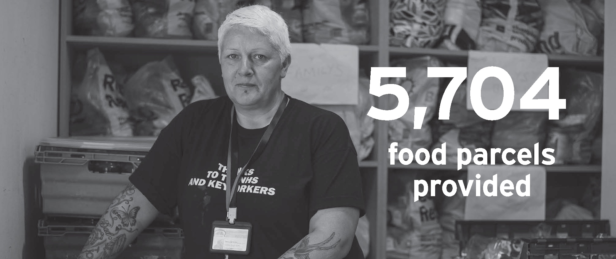
More than ever, this year has exposed and extended existing inequalities, creating significant new forms of vulnerability and hardship. Taking Trussell Trust’s forecast of a 61% increase in food parcels needed across the UK as an example, shows the precarious situation many have found themselves in.
In fact, around half of those who have used a food bank this year had never needed to use one before the pandemic. And now, the Christmas period – as always – can present additional challenges for those in need, with cold weather and other elements playing their part.
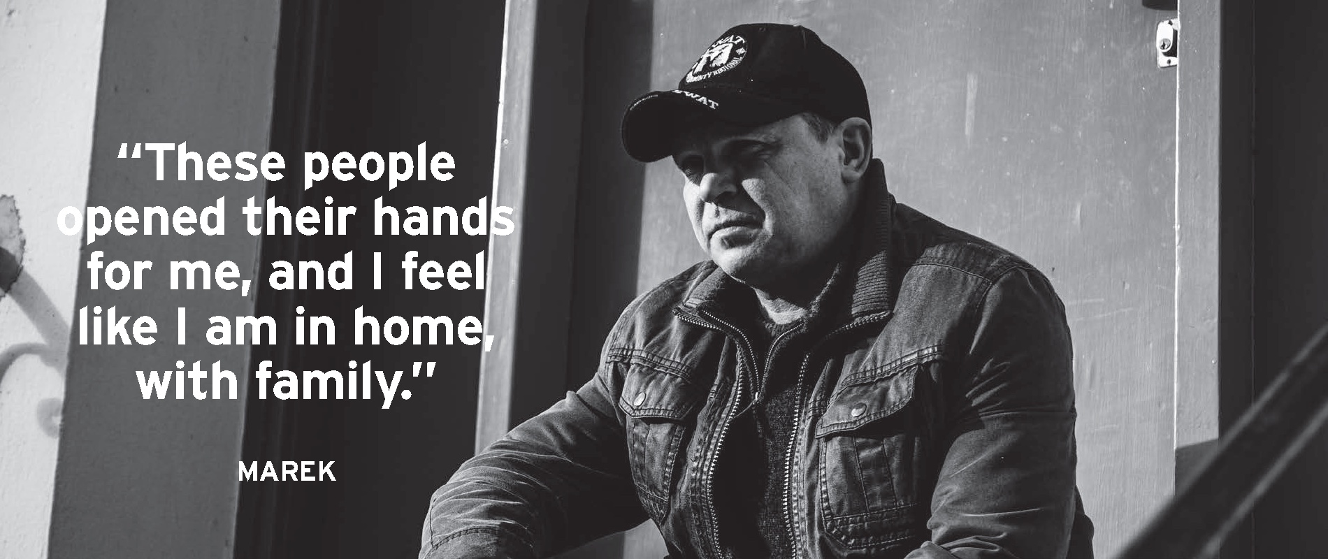
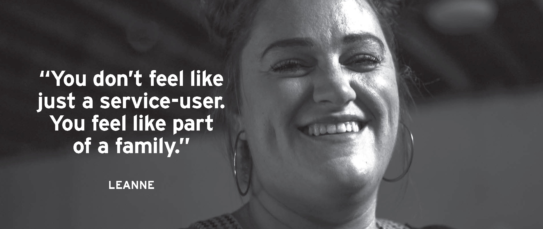
Despite all of this, our longtime friends at the Good Shepherd, a homeless charity based in Wolverhampton, have continued in their wholehearted effort to support the vulnerable.
Our Friends at The Good Shepherd
Good Shepherd have always followed their aim to end homelessness in Wolverhampton and sustainably support people out of poverty.
Since 2003, the charity has provided a food service in the city, further expanding to offer a support service, meaningful activity programmes, and a Housing First service – all from their base right next to Molineux stadium.
Sadly, this year’s circumstances have left Good Shepherd with a drastic loss of income from key fundraising events and in some cases, even the Public Health guidelines have left their volunteers on the sidelines.
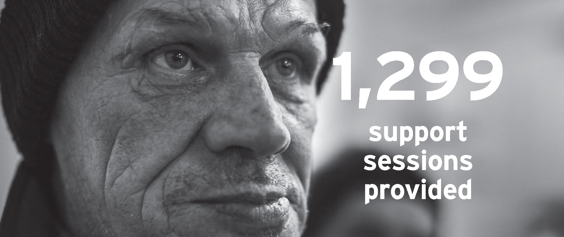
Nevertheless, the Good Shepherd remained open to those who need their support now more than ever. During July to September alone, their dedicated team provided 7169 hot meals, 1082 individual food parcels and 330 parcels for vulnerable families. Here are the key annual stats achieved this year.
Time and time again, the team at the Good Shepherd has shown us how compassion and generosity can achieve incredible things. That’s why we’ve been proud supporters of theirs over the past few years – helping them to achieve their mission in any way we can.
From volunteering to their most recent website build, it’s important to us that throughout each year we support the Good Shepherd in the ways we know how to. But for this Christmas, we wanted to support the Good Shepherd beyond our marketing, creative and photography services – donating £500 which was subsequently doubled to £1,000 as part of their festive ‘Big Give’ campaign (which raised an outstanding and vital £8,399 in total).
External support and donations to the Good Shepherd are essential, with each action making a life changing difference to their service users. Not only can it provide a path out of poverty for service users but it’s also the reason of hope for many, especially across the Christmas season. After all, it’s charities like the Good Shepherd that help to bring joy, safety and opportunity to those in need.
So we just wanted to say a huge thank you to the team at Good Shepherd for continuing the amazing work that they do. And we hope you’ll join us by sharing their story to raise awareness during this crucial time.
Over the past few years, web portals have become popular platforms for businesses. Why? Because organisations have recognised the increased need for communications in a non-public environment. Web portals help to achieve that goal, with the added benefit of directly interacting and connecting to stakeholders – in particular, customers, partners or employees.
So, with the help of our in-house web team, we’re exploring the world of web portals. Starting with what they are, we’ll highlight some examples of the best web portal design, explore top tips and find out why they’ve become so useful.
What is a web portal?
Before we delve into the top tips and tricks for web portal design, it’s important to know what one is!
Simply put, a web portal is a web-based platform that contains information specifically targeted at a user group. Usually not accessible by the public, a web portal will house a variety of information, for example, the latest internal company policies, employee expense submission tools and internal discussion boards.
Focusing on utility, portals have quickly become the go-to hub of communication for a number of businesses. They allow users to connect with one another, with focused site navigation helping find content that’s relevant, both quickly and efficiently. They are often developed with multiple devices in mind too – offering instant connectivity when needed.
Common types of web portals include company intranets, non-public forums and digital asset management systems to name a few.
The differences between a website and a web portal
By now, you may be thinking “how is this different from a website?”. Although it’s easy to confuse the two considering they do share some features, there are some distinct differences.
A website consists of a collection of pages on the internet that relate to one another and can be accessed by anyone via a web browser using a specific domain. Whereas, a portal is non-public and provides highly targeted information to specific users that most often are required to log in for access.
Still unsure? The helpful table below summarises the differences between the two:
Public Websites
Web portals
Publicly accessible and owned by an organisation.
Hidden access points require users to be supplied with login information.
By default, there are no audience restrictions.
Owned and used by organisations to supply information to stakeholders on an internal level.
Content is designed for a wider audience, with specific objective-driven content leading the user journey.
User specific and targeted towards a certain group of individuals.
Most often requires login access to the user profile.
Content is designed for an internal audience with ‘private-file access’ authorised by admins.
Our Best Web Portal Design Examples
As you may have realised by now, web portals can be designed for a number of reasons – each with individual user experience (UX) features and user journeys. So, we thought we’d share a few portal examples and how their purpose has impacted their design:
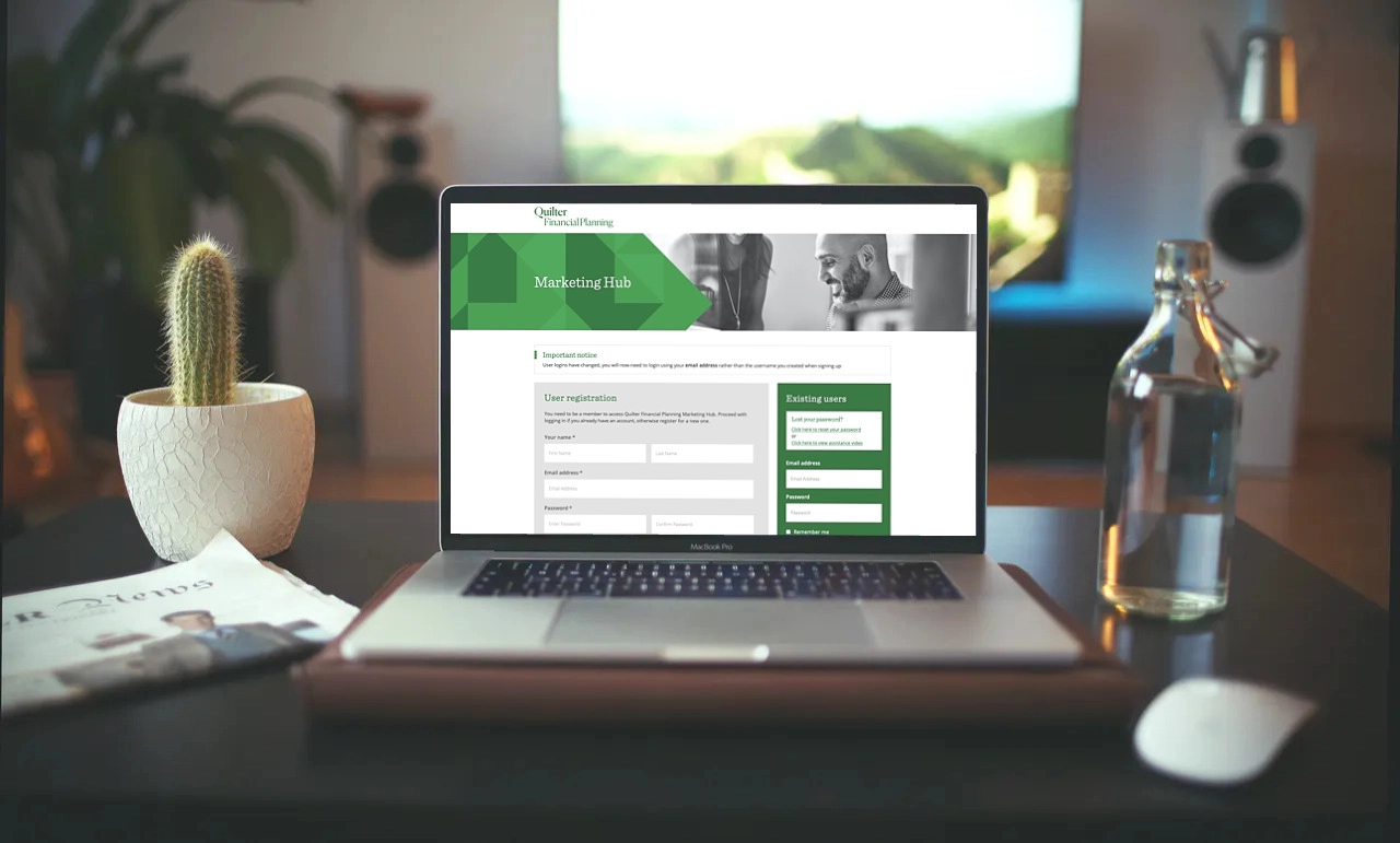
Quilter Marketing Portal
Member-only file access and ordering.
Our web team created the Quilter Marketing Portal with the purpose of giving Quilter advisers access to resources and the ability to place orders. The portal provides resources and an eCommerce ordering system all in one place. Users can also access documents for their own marketing purposes with ease, placing orders on material with minimal delivery times when needed.
Marketing Portal
National Trust Portal
Digital Asset Management system.
The National Trust Portal is a digital asset management platform for brand licensees and was designed to keep stakeholders on the same file version, improving brand consistency across the board. With all relevant files accessed through one distribution platform, it’s the perfect way to enhance marketing efficiency. An alternative would be having human resources sending files direct to the licensees, potentially introducing the risk of human error, such as the loss of files or providing out-of-date versions, which could delay processes.
Digital Asset Management (DAM) System
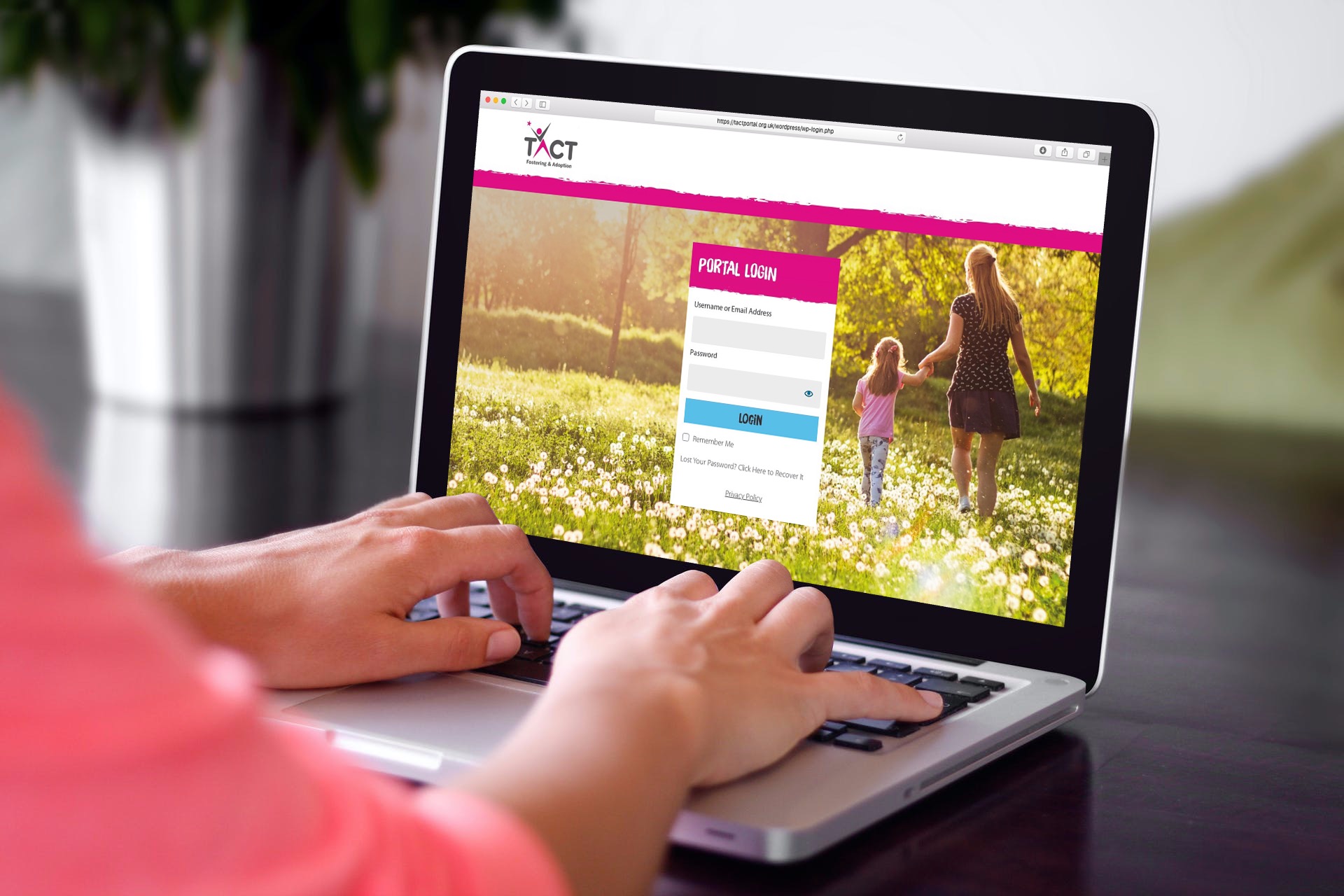
TACT portal
Non-public forum.
The main purpose of the TACT portal forum is to facilitate stakeholder network’s communications, along with a central resource for policy documents and blogs or news. By adding a detailed user access management system, the forum simply controls what information can be seen in certain locations, keeping content relevant to all users, regardless of their whereabouts. In addition, a targeted events and training feed serves as a 24/7 point of reference for the latest opportunities in the relevant location.
Networking and Communications Portal
The web portal development process
Web portal development steps include:
Brainstorming
The first step before designing a web portal is brainstorming and research. In this stage you’ll need to answer questions on your main purpose, goals and the basic features your portal will need. Remember, web portals are driven by utility and it’s important to design something that will work for its users. Think about who your main target audience is too. This is extremely important as it’ll shape the portals content and design stage.
Planning
With your target audience and goals in mind, it’s time to establish user access needs. Will the content change based on who has logged in? What information is needed to achieve your short and long term goals? These are questions that you should know the answer to.
Collate all of the information together from the brainstorming stage to create a site map and user access level map. This will indicate what content is needed on the site and is essential to developing a navigational system.
In this stage, you should also consider things such as what content management system (like WordPress) to use, what integrations are required and the specific interactive elements it needs, such as eCommerce functionality or discussion boards.
Design
Having a good web design and user experience is essential even in a non-public facing communications platform. The design elements of the portal should therefore reflect your brand, focus on utility, and also remain tailored to the topic and your target audience.
When designing the prototype, choose a consistent theme and decide on what fonts, colours and images that you want to use.
When writing content, make sure it’s informative, easy to access and easy to digest. Be sure to incorporate images and videos where necessary too.
Development
In this stage your development team will create the website, bringing the prototype to life. The development team will be able to advise on the optimal order of the portal’s development, suiting both the established timeline and your internal processes. Our top tip is to ensure that the communication lines are open as there might be some areas that require further discussion or adjustment.
Content upload & testing
Conducting both development and user tests – once final content has been uploaded to the portal – is key. This step will help all stakeholders to understand any errors and fix bugs.
Once this is done, all is signed-off and files are good to go to the hosting server, you’re ready to launch! Once launched, always remember to always keep the portal up-to-date and ensure it’s well-maintained.
Hopefully, you’ve learnt a little more about web portals and their design process with the help of our extensive guide.
So, will you be creating your own online portal? Let us know by tweeting us or contacting us directly.
With ‘instant buy’ buttons and virtual shopping carts now a familiar sight, buying and selling online has never been easier. As eCommerce web design continues to evolve and purchasing channels increase in popularity, it’s ever more apparent that as a consumer, you can purchase anything online. Some restaurants even have online ordering in place with loyalty programs (and those who don’t could go now and see what software they might need to get set up for online ordering) Seriously, though, try and think of a product that you can’t find online – we couldn’t think of one…
We’ve said it before, but your website acts as your virtual shop window. A concept that’s even more fitting when you add eCommerce into the mix. When business owners choose to build an eCommerce website, irrespective of whether they use professional woocommerce developers or otherwise, they are ultimately making the decision to operate an online store. Only this store has less overheads and is available to consumers around the clock.
For anyone who isn’t familiar with eCommerce, the term refers to any form of transaction conducted online. Typically, eCommerce platforms are grouped by transaction type. From sites built for B2B transactions (think print management services or specialist industries) to your habitual Amazon and ASOS orders which add to the millions of daily online B2C transactions. And then you have C2C purchases, revolutionised by the simplicity of Ebay – they’re all online stores, and they all represent how eCommerce has changed business.
How does eCommerce benefit consumers?
There’s a reason why eCommerce has changed how we conduct business. Simply put, it benefits consumers.
Today, experience is everything and loyalty can waver quickly. Online shopping helps to accommodate the buying habits of customers, with convenient experiences built to retain that loyalty and keep consumers shopping. For example, most eCommerce websites are available 24/7. And without a physical location or closing times, online customers can make a purchase anywhere and at any time.
Users benefit from instant access too. For the most user-friendly eCommerce sites, a purchase can be made in a matter of seconds – a few clicks and you’re done. Brands are continuing to build on that too. Some eCommerce websites make use of online customer service features (whether chat bots or live chat), helping to provide information on everything from newly launched products to when products are back in stock. It’s all direct and it’s all online – just as long as they know how to find your site on search engines.
But when you get it right, it’s convenient, simple and it just works. It’s why shopping habits have drastically changed and for better or worse, has forced businesses and eCommerce web design to adapt.
“It’s predicted that by 2021 mobile eCommerce sales will account for over half of total eCommerce sales.”
Why do some eCommerce sites fail?
Design and Operation Issues
eCommerce website design isn’t as simple as throwing a few products together and adding shopping cart functionality to your site. It takes real planning, from the design stage all the way through to the business operations of the site itself.
Your design has to consider the user journey. Factor in where your potential customer will land on your site and how easy it is to navigate through to a purchase. With a user-friendly site, this process will happen flawlessly time and time again.
Think mobile optimisation too. It’s now an unspoken rule that all websites should be optimised for mobile devices and that’s even more true for eCommerce. From product pages to the checkout system, each of your web pages and features has to work on mobile. And if it doesn’t, the likelihood is that you’re turning potential customers away because of a poor shopping experience.
Outside of design, you must also consider website operations. Firstly, does your site require registration and if so, is it automatic or does it require internal input? When it comes to products, have your staff been trained to confidently upload new product lines? Remember, your eCommerce site won’t run itself. Online customer support is important too, whether live or enhanced by AI. It all adds to the convenience that online shoppers seek and is something you can’t afford to neglect.
Image and Video Quality
It’s not only the design of your platform that you need to consider. If you’re selling online then product presentation, and therefore image and video quality, is key. Potential customers are likely to shop elsewhere (bouncing from your page) if your images aren’t displaying correctly, are poor in quality or you don’t have any.
Use high quality imagery to represent the high quality products that you’re offering. Ensure all images are sized correctly and accompanied with relevant and useful product descriptions to help guide the user journey to purchase.
Don’t forget about continuity either. From image and video crops to backgrounds, it helps to have your products represented in a familiar brand style.
The Wider Marketing Plan is Failing
You may have an immaculately designed eCommerce site, professionally presented product images and a simple user journey but your site is still failing. Why? Well it could be down to your wider marketing and business operations.
Take it from us, your website needs support. Similar to a physical store, your virtual shop needs marketing – how else do you expect consumers to find and use it?
In anticipation of the site launch, it could be that you plan a communications campaign with a press release or supporting social media material. Digital marketing plays a huge role too. If you want a certain product page to rank at the very top of a search engine you need to put time into SEO and other supporting digital marketing activities. Without it, your site may flop before it’s even launched.
How to integrate eCommerce into your website
Between image selection and your design and operations planning, you must also find and select the right eCommerce platform to integrate with your site.
With more and more consumers choosing to shop online, we’ve seen a rise in ways that you can integrate eCommerce into your website. So, whether you’re looking to start an eCommerce site or integrate the feature into an existing website, you have options.
Generally we, like millions around the world, choose the eCommerce plug-in best known as WooCommerce – best suited to WordPress sites. Here’s what our Technical Director, and head of web design, Luke had to say…
“We’ve found that WooCommerce strikes the right balance between features and ease of use. It also allows us to integrate the eCommerce functionality directly into WordPress to reduce the management overhead and cost of two separate systems.”
Luke Turner Technical Director
In short, eCommerce is a booming digital industry and has drastically changed business by offering consumers repeat purchase convenience. However, designing a successful online shopping experience does come with its challenges.
If you’re looking for more information on eCommerce web design (or maybe you’re planning to launch your own), don’t be afraid to get in touch. You can drop us a message on social media or contact us directly here.
Most graphic designers are passionate about typography – to some, it’s an art. But for those outside of creative design, typography may seem to be of minor importance.
So you may be thinking, ‘why is typography important in web design?’. The answer is simple – words on your website matter. Typography holds the power to draw readers in, impacting on user perception, user experience and readability.
Think of your web pages as your digital shop window. And no, we’re not just talking about ecommerce web design here. In general, a web page should grab attention but also be clear, easy to read and effective enough to help guide the user to a goal – whether that be a conversion, link click or purchase.
Your choice of typography plays a huge role in whether or not that goal is completed. Use an uninspiring, standard font and your audience will get bored and bounce off your site. Use something too overwhelming and suddenly your website is too difficult to read, with important lines of text ignored and avoided. However, get it right and your website becomes a powerful tool.
Typography choice really is an important decision, and one that should be considered both visually and systematically. So how do you get it right?
How to use typography in web design
There are a number of ways to approach typography when it comes to web design. Consider the sheer number of available fonts, the font size, how they mix with your background colours and even the spacing and line height and it can quickly seem like a nightmare.
To make matters worse, web designers and graphic designers can sometimes disagree (as they do with the age old ‘Lorem Ipsum debate’). However, amidst the debate (and the growing number of fonts), a decision has to be made.
That’s why we’ve listed five key principles on how to best use typography in your web design, which will guide you through the process and help you reach your decision…
1. Approach web typography decisions systematically
In web design, every typographic decision needs to simultaneously accomplish a variety of results. Each headline that you create for your site not only needs to be easy to read and search engine friendly, but the chosen typeface should also fit in with your company brand guidelines.
That’s quite a lot of requirements for a headline and on some occasions, this can cause a problem. For example, styling and branding guidelines may require the designer to use a specific typeface and font, which cannot be used directly online. This is when a decision has to be made: Do you move away from the given brand guidelines so you can achieve optimal search engine friendliness, which often asks for extended text?
Do you use an image replacement solution to avoid the extra costs associated with complex responsive typography?
Do you consider using sIFR (rich flash based dynamic font) that allows you to embed fonts into content presentation? In many cases, the myriad of goals web typography needs to serve will be conflicting with each other. With each web build project you need to prioritise and define which goals are more important than the others. Some clients will be more concerned with maintaining brand identity, and others will put search engine friendliness higher. When it comes to typographic decisions you need to focus on your goal. Different sites require different needs and there is never only one answer for each individual problem. It’s key for all teams to work in unison, analysing each of the strengths and weaknesses presented. The importance of font choice can’t be understated. Only when using a systematic approach can you truly find a solution that works for everyone, but more importantly, works for your website.
2. Utilise information hierarchy
When choosing typography it is important to define precedence. This includes the type size, colour, weight, case and whether you choose to use normal font or italics. All areas of font styles need to be considered as your choices will have an impact on how your web copy is perceived and therefore how your website performs.
Web users will also react differently depending on where copy is placed on your web pages. Type placed in the upper body of the page will be of more importance than type placed in a sidebar or on a footer. However, placing a larger size type in the sidebar will help draw attention. Note: always carefully balance your type in the main body text and sidebar areas based on how you want the user to digest the information that you are presenting to them.
3. Design for optimum flow
For a page to flow seamlessly, hierarchy is key. When the hierarchy on your web page is balanced, it helps users recognise the most important elements on a page as they are scrolling through. This, in turn, will help to create an effective user journey through your website – helping you reach goals on key pages. Other typographic issues such as copy spacing can also affect the page flow. White spacing, tracking, leading, indention, padding and margins are all key elements that help to form an effective page flow.
4. Maintain accessibility, readability and legibility alongside branding
If you want your website to stand out from the crowd, then it has to be visually stunning. And while that’s true, you must still consider accessibility and the general readability of your chosen font style. Does your branding consist of elaborate designs and eccentric fonts? If so, you may need to tone your design down slightly and find a style in line with user experience for your site. And if you’re unsure, ask yourself these simple questions.
Firstly, how legible is your chosen font? Can you make out all of the characters on your website with ease? Your website could hit a stumbling block should its visitors not be able to clearly read the characters displayed on screen. The goal is to make it as easy as possible, without straying too far away from your brand guidelines.
Aside from individual characters, you must also question how your copy is displayed across your entire web design. Your website will likely consist of various components – so be sure to check the legibility of your font style within all of those components. Don’t forget the different browser types too! When you’re happy with the legibility of your copy, be sure to test whether it renders the same across all web browsers.
Readability is key too. Think character spacing, alignment, paragraph spacing and line length – all important decisions that can aid the effectiveness of your website. Put simply, your chosen font should be easy-to-read without straining your eyes. If you’re struggling, then your website users will too. It’s key that your typography is accessible for those with visual impairments too. For us, when it comes to web design, we follow Google’s best practice guidelines on interface design and readability and accessibility.
And finally, with all of this in mind, please don’t forget about the responsiveness of your website. Your typography choices have an impact on all of the above and website responsiveness. Remember, what looks good on desktop may not carry the same impact on mobile. Sometimes, less really is more!
5. Don’t be afraid to experiment
By following the previous points, you should now know the key principles of web typography. However, with those in mind, don’t forget to be creative and experiment. Even if your brand operates in what’s known as a more conservative sector, typography can give your website (and brand) a huge lift. Just experiment with it and find something that works.
Taking inspiration from custom website designs helps by getting around mental blocks. Experimenting with what we believe to be wrong in website design. Playing with the possibilities by breaking the rules and a willingness to be wrong as part of the process to developing something that stands out.
As we mention above, it shouldn’t be over the top; just unique enough to be attention grabbing and set you apart from the competition.
Typography choice can help you unlock your website’s full potential. As a creative agency, we spend a lot of time considering typography throughout our web build projects.
And with these five key principles, you should now be one step closer to understanding how to use typography in your web design.
Have we missed any tips out? What has your experience been when using typography in web design?
Be sure to let us know by getting in touch or dropping us a message on social media. You can find us on Facebook, Twitter and Instagram.